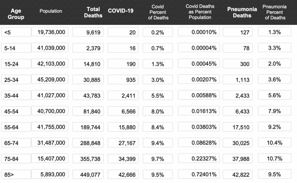
You know how I love using Filemaker to analyze data. I took US population data and ran it against Covid and Pneumonia Death data and came up with this chart (Through July 22). Imagine all the schools closed when the risk to children is far lower than even pneumonia. Covid fills the news every night and 40 million people lost their jobs. Even in those over 85 the percent dying of covid is less than one percent. In school aged children its 4/100,000th of a percent. AND the vast majority of Covid deaths involve other health problems that lower the immune system.
Where are the reported willing to tell this?
The Population numbers come from The US Census website
The Covid and Pneumonia numbers come from the CDC
The data set from the above CDC Chart
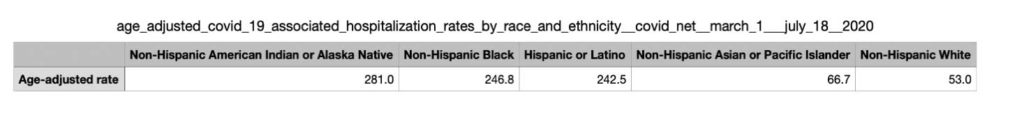
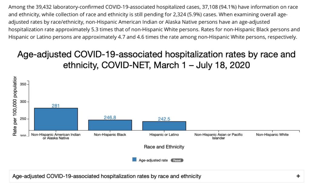
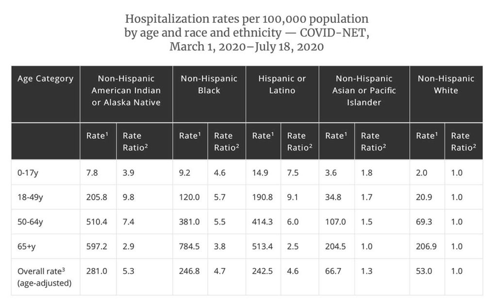
A related chart on HOSPITALIZATIONS.
Notice the HUGE racial discrepancy
This looks a lot like eugenics. You get numbers needed to frighten people using the least wealthy and educated segments of the population.
This video is enough to make you wonder it it explains the numbers you see above.
What I’ve been looking for is the morbidity rate BY HOSPITAL.
I wonder if the numbers are being increased in hospitals serving the poor.

This is a VERY IMPORTANT article and video!!!!
Thank you Dr. Baehr and Jerry Nordskog for getting these TRUE facts and this PASSIONATE video out!!!
Wake up AMERICA